|
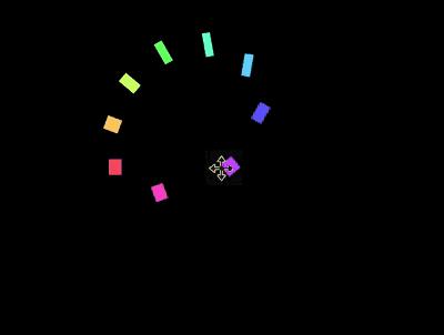
导读网页的本质就是超级文本标记语言,通过结合使用其他的Web技术(如:脚本语言、公共网关接口、组件等),可以创造出功能强大的网页。因而,超级文本标记语言是万维网(Web)编程的基础,也就是说万维网是建立... 网页的本质就是超级文本标记语言,通过结合使用其他的Web技术(如:脚本语言、公共网关接口、组件等),可以创造出功能强大的网页。因而,超级文本标记语言是万维网(Web)编程的基础,也就是说万维网是建立在超文本基础之上的。超级文本标记语言之所以称为超文本标记语言,是因为文本中包含了所谓“超级链接”点。 本篇文章给大家带来的内容是关于如何使用纯CSS实现一个圆环旋转错觉的动画效果,有一定的参考价值,有需要的朋友可以参考一下,希望对你有所帮助。效果预览
源代码下载https://github.com/comehope/front-end-daily-challenges 代码解读定义 dom,容器中包含 10 个 <figure class="container">
<div><span></span></div>
<div><span></span></div>
<div><span></span></div>
<div><span></span></div>
<div><span></span></div>
<div><span></span></div>
<div><span></span></div>
<div><span></span></div>
<div><span></span></div>
<div><span></span></div>
</figure>定义容器尺寸: .container {
width: 17em;
height: 17em;
font-size: 16px;
}定义子元素的尺寸,和容器相同: .container {
position: relative;
}
.container div {
position: absolute;
width: inherit;
height: inherit;
}在子元素的正中画一个黄色的小方块: .container div {
display: flex;
align-items: center;
justify-content: center;
}
.container span {
position: absolute;
width: 1em;
height: 1em;
background-color: yellow;
}增加让小方块左右移动的动画效果,动画时长还会在后面用到,所以定义成变量: .container span {
--duration: 2s;
animation: move var(--duration) infinite;
}
@keyframes move {
0%, 100% {
left: calc(10% - 0.5em);
}
50% {
left: calc(90% - 0.5em);
}
}用贝赛尔曲线调整动画的时间函数,使小方块看起来就像在左右两侧跳来跳去: .container span {
animation: move var(--duration) cubic-bezier(0.6, -0.3, 0.7, 0) infinite;
}增加小方块变形的动画,使它看起来有下蹲起跳的拟人效果: .container span {
animation:
move var(--duration) cubic-bezier(0.6, -0.3, 0.7, 0) infinite,
morph var(--duration) ease-in-out infinite;
}
@keyframes morph {
0%, 50%, 100% {
transform: scale(0.75, 1);
}
25%, 75% {
transform: scale(1.5, 0.5);
}
}至此,完成了 1 个方块的动画。接下来设置多个方块的动画效果。 为子元素定义 CSS 下标变量: .container div:nth-child(1) { --n: 1; }
.container div:nth-child(2) { --n: 2; }
.container div:nth-child(3) { --n: 3; }
.container div:nth-child(4) { --n: 4; }
.container div:nth-child(5) { --n: 5; }
.container div:nth-child(6) { --n: 6; }
.container div:nth-child(7) { --n: 7; }
.container div:nth-child(8) { --n: 8; }
.container div:nth-child(9) { --n: 9; }旋转子元素,使小方块分布均匀地在容器的四周,围合成一个圆形: .container p {
transform: rotate(calc(var(--n) * 40deg));
}设置动画延时,现在看起来就像是一群小方块贴着一个圆的内边线在旋转了(但实际上没有任何元素在做旋转运动,大脑感觉到的旋转是一种错觉): .container span {
animation-delay: calc(var(--duration) / 9 * var(--n) * -1);
}最后,为小方块上色: .container span {
background-color: hsl(calc(var(--n) * 80deg), 100%, 70%);
}大功告成!想要了解更多css知识,可以去php中文网css教程栏目去学习一下。 相关推荐: 以上就是如何使用纯CSS实现一个圆环旋转错觉的动画效果(附源码)的详细内容,更多请关注php中文网其它相关文章! 网站建设是一个广义的术语,涵盖了许多不同的技能和学科中所使用的生产和维护的网站。 |
温馨提示:喜欢本站的话,请收藏一下本站!
本站发布的Win7纯净版系统、Win10纯净版和XP纯净版系统仅为个人学习测试使用,请在下载后24小时内删除,不得用于任何商业用途,否则后果自负,请支持购买微软正版软件!
本站所有资源全部来自于网络资源,如侵犯到您的权益,请及时通知我们(peng896066052@126.com),我们会及时处理.
Copyright © 2018-2020 雨林木风下载站