|
导读网页的本质就是超级文本标记语言,通过结合使用其他的Web技术(如:脚本语言、公共网关接口、组件等),可以创造出功能强大的网页。因而,超级文本标记语言是万维网(Web)编程的基础,也就是说万维网是建立... 网页的本质就是超级文本标记语言,通过结合使用其他的Web技术(如:脚本语言、公共网关接口、组件等),可以创造出功能强大的网页。因而,超级文本标记语言是万维网(Web)编程的基础,也就是说万维网是建立在超文本基础之上的。超级文本标记语言之所以称为超文本标记语言,是因为文本中包含了所谓“超级链接”点。 本篇文章给大家带来的内容是CSS中常见的布局有哪些?5种常见的布局介绍。有一定的参考价值,有需要的朋友可以参考一下,希望对你们有所帮助。本文将介绍如下5种常见的布局:
一、单列布局
1、常见的单列布局:
2、如何实现 对于第一种,先通过对header,content,footer统一设置width:1000px;或者max-width:1000px(这两者的区别是当屏幕小于1000px时,前者会出现滚动条,后者则不会,显示出实际宽度);然后设置margin:auto实现居中即可得到。 <p class="header"></p> <p class="content"></p> <p class="footer"></p> .header{
margin:0 auto;
max-width: 960px;
height:100px;
background-color: blue;
}
.content{
margin: 0 auto;
max-width: 960px;
height: 400px;
background-color: aquamarine;
}
.footer{
margin: 0 auto;
max-width: 960px;
height: 100px;
background-color: aqua;
}对于第二种,header、footer的内容宽度不设置,块级元素充满整个屏幕,但header、content和footer的内容区设置同一个width,并通过margin:auto实现居中。 <p class="header">
<p class="nav"></p>
</p>
<p class="content"></p>
<p class="footer"></p>.header{
margin:0 auto;
max-width: 960px;
height:100px;
background-color: blue;
}
.nav{
margin: 0 auto;
max-width: 800px;
background-color: darkgray;
height: 50px;
}
.content{
margin: 0 auto;
max-width: 800px;
height: 400px;
background-color: aquamarine;
}
.footer{
margin: 0 auto;
max-width: 960px;
height: 100px;
background-color: aqua;
}二、两列自适应布局 两列自适应布局是指一列由内容撑开,另一列撑满剩余宽度的布局方式 1.float+overflow:hidden 如果是普通的两列布局,浮动+普通元素的margin便可以实现,但如果是自适应的两列布局,利用float+overflow:hidden便可以实现,这种办法主要通过overflow触发BFC,而BFC不会重叠浮动元素。由于设置overflow:hidden并不会触发IE6-浏览器的haslayout属性,所以需要设置zoom:1来兼容IE6-浏览器。具体代码如下: <p class="parent" style="background-color: lightgrey;">
<p class="left" style="background-color: lightblue;">
<p>left</p>
</p>
<p class="right" style="background-color: lightgreen;">
<p>right</p>
<p>right</p>
</p>
</p>.parent {
overflow: hidden;
zoom: 1;
}
.left {
float: left;
margin-right: 20px;
}
.right {
overflow: hidden;
zoom: 1;
}注意点:如果侧边栏在右边时,注意渲染顺序。即在HTML中,先写侧边栏后写主内容 2.Flex布局 Flex布局,也叫弹性盒子布局,区区简单几行代码就可以实现各种页面的的布局。 //html部分同上
.parent {
display:flex;
}
.right {
margin-left:20px;
flex:1;
}3.grid布局 Grid布局,是一个基于网格的二维布局系统,目的是用来优化用户界面设计。 //html部分同上
.parent {
display:grid;
grid-template-columns:auto 1fr;
grid-gap:20px
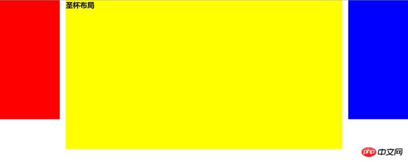
}三、三栏布局 特征:中间列自适应宽度,旁边两侧固定宽度,实现三栏布局有多种方式(可以猛戳实现三栏布局的几种方法),本文着重介绍圣杯布局和双飞翼布局。 1.圣杯布局 ① 特点 比较特殊的三栏布局,同样也是两边固定宽度,中间自适应,唯一区别是dom结构必须是先写中间列部分,这样实现中间列可以优先加载。 .container {
padding-left: 220px;//为左右栏腾出空间
padding-right: 220px;
}
.left {
float: left;
width: 200px;
height: 400px;
background: red;
margin-left: -100%;
position: relative;
left: -220px;
}
.center {
float: left;
width: 100%;
height: 500px;
background: yellow;
}
.right {
float: left;
width: 200px;
height: 400px;
background: blue;
margin-left: -200px;
position: relative;
right: -220px;
} <article class="container">
<p class="center">
<p>圣杯布局</p>
</p>
<p class="left"></p>
<p class="right"></p>
</article>② 实现步骤
③ 缺点
④ 伪等高布局 等高布局是指子元素在父元素中高度相等的布局方式。等高布局的实现包括伪等高和真等高,伪等高只是看上去等高而已,真等高是实实在在的等高。 此处我们通过伪等布局便可解决圣杯布局的第二点缺点,因为背景是在padding区域显示的,设置一个大数值的padding-bottom,再设置相同数值的负的margin-bottom,并在所有列外面加上一个容器,并设置overflow:hidden把溢出背景切掉。这种可能实现多列等高布局,并且也能实现列与列之间分隔线效果,结构简单,兼容所有浏览器。新增代码如下: .center,
.left,
.right {
padding-bottom: 10000px;
margin-bottom: -10000px;
}
.container {
padding-left: 220px;
padding-right: 220px;
overflow: hidden;//把溢出背景切掉
}
2.双飞翼布局 ① 特点 同样也是三栏布局,在圣杯布局基础上进一步优化,解决了圣杯布局错乱问题,实现了内容与布局的分离。而且任何一栏都可以是最高栏,不会出问题。 .container {
min-width: 600px;//确保中间内容可以显示出来,两倍left宽+right宽
}
.left {
float: left;
width: 200px;
height: 400px;
background: red;
margin-left: -100%;
}
.center {
float: left;
width: 100%;
height: 500px;
background: yellow;
}
.center .inner {
margin: 0 200px; //新增部分
}
.right {
float: left;
width: 200px;
height: 400px;
background: blue;
margin-left: -200px;
} <article class="container">
<p class="center">
<p class="inner">双飞翼布局</p>
</p>
<p class="left"></p>
<p class="right"></p>
</article>② 实现步骤(前两步与圣杯布局一样)
③ 缺点 多加一层 dom 树节点,增加渲染树生成的计算量。 3.两种布局实现方式对比:
四、粘连布局 1.特点
当main足够长时
当main比较短时
具体代码如下: <p id="wrap">
<p class="main">
main <br />
main <br />
main <br />
</p>
</p>
<p id="footer">footer</p> * {
margin: 0;
padding: 0;
}
html,
body {
height: 100%;//高度一层层继承下来
}
#wrap {
min-height: 100%;
background: pink;
text-align: center;
overflow: hidden;
}
#wrap .main {
padding-bottom: 50px;
}
#footer {
height: 50px;
line-height: 50px;
background: deeppink;
text-align: center;
margin-top: -50px;
}2.实现步骤 (1)footer必须是一个独立的结构,与wrap没有任何嵌套关系 (2)wrap区域的高度通过设置min-height,变为视口高度 (3)footer要使用margin为负来确定自己的位置 (4)在main区域需要设置 padding-bottom。这也是为了防止负 margin 导致 footer 覆盖任何实际内容。 以上就是CSS中常见的布局有哪些?5种常见的布局介绍的详细内容,更多请关注php中文网其它相关文章! 网站建设是一个广义的术语,涵盖了许多不同的技能和学科中所使用的生产和维护的网站。 |
温馨提示:喜欢本站的话,请收藏一下本站!
本站发布的Win7纯净版系统、Win10纯净版和XP纯净版系统仅为个人学习测试使用,请在下载后24小时内删除,不得用于任何商业用途,否则后果自负,请支持购买微软正版软件!
本站所有资源全部来自于网络资源,如侵犯到您的权益,请及时通知我们(peng896066052@126.com),我们会及时处理.
Copyright © 2018-2020 雨林木风下载站