|
导读网页的本质就是超级文本标记语言,通过结合使用其他的Web技术(如:脚本语言、公共网关接口、组件等),可以创造出功能强大的网页。因而,超级文本标记语言是万维网(Web)编程的基础,也就是说万维网是建立... 网页的本质就是超级文本标记语言,通过结合使用其他的Web技术(如:脚本语言、公共网关接口、组件等),可以创造出功能强大的网页。因而,超级文本标记语言是万维网(Web)编程的基础,也就是说万维网是建立在超文本基础之上的。超级文本标记语言之所以称为超文本标记语言,是因为文本中包含了所谓“超级链接”点。 我们在和别人通过微信或者qq聊天的时候都会有对话框气泡,那么这个对话框气泡是怎么实现的呢?本篇文章来给大家介绍一下如何使用CSS制作我们经常可以看到的对话框气泡,下面我们来看具体的内容。首先我们来看一下我们需要制作的对话框的效果
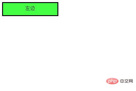
接下来我们就来看看这几种对话气泡的实现方法 我们来看一下如何实现箭头向左的对话气泡 我们需要先来制作一个框架
代码如下 HTML代码 <div class="balloon-left"> 左边 </div> CSS代码 .balloon-left {
position: relative;
display: inline-block;
padding: 0 15px;
width: auto;
min-width: 150px;
height: 40px;
line-height: 34px;
text-align: center;
background: #44FF44;
border: 3px solid #000000;
z-index: 0;
}接着,我们使用:before来制作箭头部分,用:after来制作箭头的边 CSS代码 .balloon-left:before {
border-style: solid;
border-width: 10px 10px 10px 0;
border-color: transparent #44FF44 transparent transparent;
content: "";
position: absolute;
top: 50%; left: -8px;
margin-top: -9px;
display: block;
width: 0px;
height: 0px;
z-index: 0;
}
.balloon-left:after {
border-style: solid;
border-width: 11px 11px 11px 0;
border-color: transparent #000000 transparent transparent;
content: "";
position: absolute;
top: 50%; left: -12px;
margin-top: -10px;
display: block;
width: 0px;
height: 0px;
z-index: -1;
}运行效果入下所示
这样就完成了第一个对话气泡 下面我们就来根据上述方法来制作箭头向右的对话气泡 代码如下 HTML代码 <div class="balloon-right"> 右边 </div> CSS代码 .balloon-right {
position: relative;
display: inline-block;
padding: 0 15px;
width: auto;
min-width: 150px;
height: 40px;
line-height: 34px;
text-align: center;
background: #44FF44;
border: 3px solid #000000;
z-index: 0;
}
.balloon-right:before {
border-style: solid;
border-width: 10px 0 10px 10px;
border-color: transparent transparent transparent #44FF44;
content: "";
position: absolute;
top: 50%; right: -8px;
margin-top: -9px;
display: block;
width: 0px;
height: 0px;
z-index: 0;
}
.balloon-right:after {
border-style: solid;
border-width: 11px 0 11px 11px;
border-color: transparent transparent transparent #000000;
content: "";
position: absolute;
top: 50%; right: -12px;
margin-top: -10px;
display: block;
width: 0px;
height: 0px;
z-index: -1;
}运行上述代码的效果如下所示:是一个向右的气泡
最后我们来说箭头向左和向右的对话气泡 我们需要用到border-radius属性让气泡变得圆滑 代码如下 HTML代码 <div class="balloon-top">向上</div> <div class="balloon-bottom">向下</div> CSS代码 .balloon-top {
position: relative;
display: inline-block;
padding: 0 15px;
width: auto;
min-width: 150px;
height: 40px;
line-height: 32px;
text-align: center;
background: #44FF44;
border: 3px solid #000000;
z-index: 0;
border-radius: 60%;
}
.balloon-top:before {
border-style: solid;
border-width: 0 10px 10px 10px;
border-color: transparent transparent #44FF44 transparent;
content: "";
position: absolute;
top: -8px; left: 50%;
margin-left: -9px;
display: block;
width: 0px;
height: 0px;
z-index: 0;
}
.balloon-top:after {
border-style: solid;
border-width: 0 11px 11px 11px;
border-color: transparent transparent #000000 transparent;
content: "";
position: absolute;
top: -12px; left: 50%;
margin-left: -10px;
display: block;
width: 0px;
height: 0px;
z-index: -1;
}
.balloon-bottom {
position: relative;
display: inline-block;
padding: 0 15px;
width: auto;
min-width: 150px;
height: 40px;
line-height: 34px;
text-align: center;
background-color: #44FF44;
border: 3px solid #000000;
z-index: 0;
border-radius: 60%;
}
.balloon-bottom:before {
content: "";
position: absolute;
bottom: -8px; left: 50%;
margin-left: -9px;
width: 0px;
height: 0px;
border-style: solid;
border-width: 10px 10px 0 10px;
border-color: #44FF44 transparent transparent transparent;
z-index: 0;
}
.balloon-bottom:after {
border-style: solid;
border-width: 11px 11px 0 11px;
border-color: #000000 transparent transparent transparent;
content: "";
position: absolute;
bottom: -12px; left: 50%;
margin-left: -10px;
width: 0px;
height: 0px;
z-index: -1;
}效果如下所示
总结 CSS部分有点复杂,但你可以根据以上示例通过自定义颜色和形状来制作各种类型的对话框气泡。 本篇文章到这里就全部结束了,更多精彩内容大家可以移步到php中文网的CSS视频教程栏目进一步的学习!!! 以上就是如何使用CSS制作对话框气泡的详细内容,更多请关注php中文网其它相关文章! 网站建设是一个广义的术语,涵盖了许多不同的技能和学科中所使用的生产和维护的网站。 |
温馨提示:喜欢本站的话,请收藏一下本站!
本站发布的Win7纯净版系统、Win10纯净版和XP纯净版系统仅为个人学习测试使用,请在下载后24小时内删除,不得用于任何商业用途,否则后果自负,请支持购买微软正版软件!
本站所有资源全部来自于网络资源,如侵犯到您的权益,请及时通知我们(peng896066052@126.com),我们会及时处理.
Copyright © 2018-2020 雨林木风下载站